
Mobile-First Design Approach — Why It Matters
Start with mobile, then enhance for larger screens. We’ll explain why this method produces better results and how to implement it correctly.
Read GuideLearn how to build websites that work beautifully on every device. From mobile-first approaches to flexible layouts, we’ll teach you the skills Malaysia’s web professionals need.

Get started with our most popular guides on responsive design, mobile-first development, and modern CSS techniques.
Start with mobile, then enhance for larger screens. We’ll explain why this method produces better results and how to implement it correctly.
Read Guide
Media queries are the backbone of responsive design. Learn how to write them effectively and choose breakpoints that match real device sizes.
Read Guide
Modern layout techniques that adapt automatically to different screen sizes. We’ll cover flexbox and grid with practical examples you can use today.
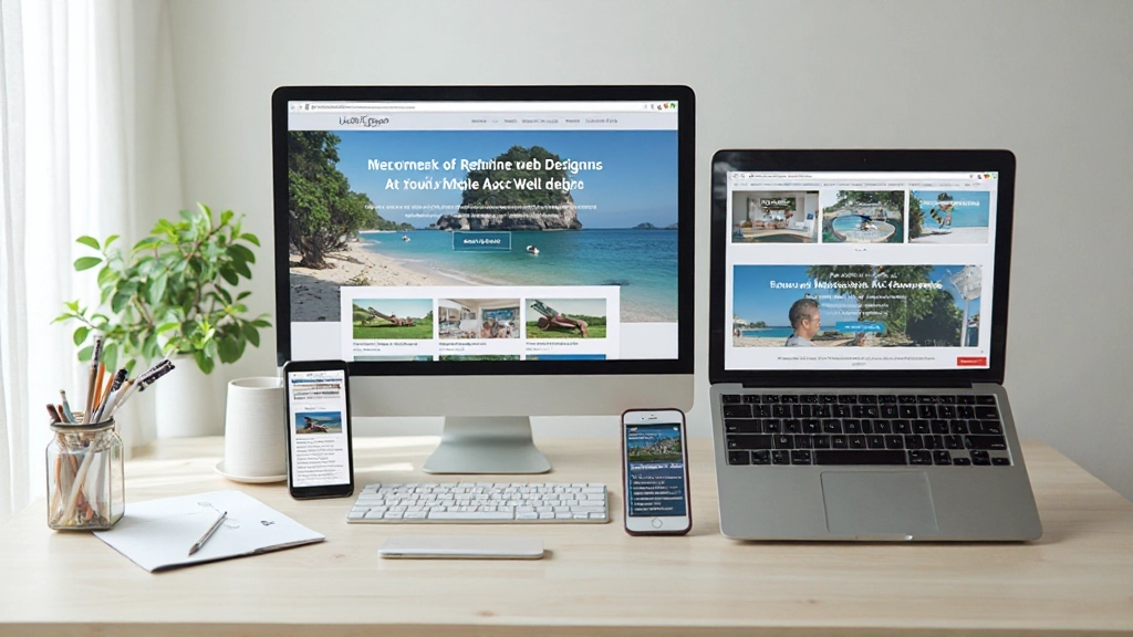
Read GuideMobile devices now account for more than half of all web traffic. If your website isn’t responsive, you’re losing potential customers and visitors.
Users expect seamless browsing on phones and tablets. We teach you to design for these devices first.
Search engines prioritize responsive websites. Responsive design is essential for visibility.
Serve every visitor well, whether they’re on a smartwatch, phone, tablet, or desktop computer.
Responsive techniques help reduce file sizes and improve performance on all devices.
We’ve designed a learning path that takes you from fundamentals to advanced techniques, step by step.
Start with HTML and CSS basics. We’ll cover flexible grids, responsive images, and the viewport meta tag — the foundation of everything that follows.
Learn to write effective media queries that target specific screen sizes. We’ll show you how to choose breakpoints that match real device usage patterns.
Discover Flexbox and CSS Grid — the modern tools that make responsive layouts easier and more powerful than ever before.
Build real websites from start to finish. You’ll create responsive sites that work on all devices and understand every decision you make.
“Wasn’t sure where to start with responsive design, but the step-by-step approach made it click. Now I’m actually building sites that work on every device instead of guessing.”
“I’ve been doing web design for years but never really understood flexbox and grid. The explanations here are clear and the examples actually work. Definitely using these techniques on my next project.”
“The mobile-first section was a game changer for how I think about layouts. My sites load faster and actually work better. Plus the resources are great to reference when I get stuck.”
Everything you need to master responsive web design, organized for easy learning.
In-depth written guides covering every aspect of responsive design, from theory to practical implementation.
Real, working code samples you can copy, modify, and learn from. See exactly how responsive techniques work.
Build actual websites as you learn. Each project reinforces the concepts and builds your portfolio.
Learn industry standards and common patterns used by professional web developers across the world.
Understand how to test your responsive designs on real devices and browsers to ensure everything works.
Learn which tools help with responsive design work, from browser dev tools to modern frameworks.
Responsive design uses flexible layouts and media queries to adapt to any screen size. Adaptive design detects device types and loads pre-designed layouts. We focus on responsive because it’s more flexible and future-proof.
No, responsive design is primarily HTML and CSS. JavaScript can enhance responsive sites, but you can build fully responsive websites with just HTML and CSS fundamentals.
Common breakpoints are 480px (mobile), 768px (tablet), and 1024px (desktop). But the best approach is to design your content first, then add breakpoints where your layout needs them.
Mobile-first is generally better because it forces you to prioritize content and performance. You enhance the experience for larger screens rather than stripping it down for mobile.
Browser dev tools have device simulators for quick testing. For thorough testing, use real devices. Tools like BrowserStack let you test on actual phones and tablets remotely.
Modern responsive techniques work in all current browsers. For older browsers, use progressive enhancement — the site works without advanced features but better in modern browsers.
Start learning today and build websites that work perfectly on every device. Our comprehensive guides and practical examples will take you from beginner to confident developer.