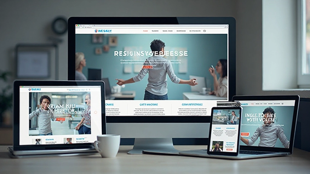
Building Modern Websites That Actually Work
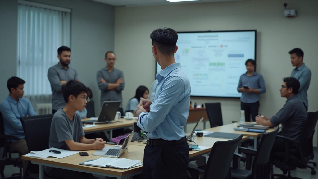
We’re FluidGrid Academy Sdn Bhd, training designers and developers across Malaysia in responsive web design, mobile-first development, and adaptive layouts for today’s multi-device world.

How We Started
We’ve been training web professionals since 2017. Back then, responsive design was becoming essential—but most training programs weren’t teaching it properly. Instructors would talk about media queries and breakpoints without showing the real-world complexity. Students got frustrated. We got frustrated watching it happen.
So we built something different. FluidGrid Academy Sdn Bhd started with a simple idea: teach responsive design the way actual projects demand it. Not theoretical frameworks. Not outdated best practices. The skills that work when you’re building real websites for real clients across Malaysia and beyond.
Today, we’ve trained over 800 professionals in responsive web design, mobile web design, and adaptive layout techniques. Our students work at agencies, startups, and in-house teams. They’re building sites that look good on every device—because they learned how to do it properly.
How We Teach Responsive Design
Mobile-First Thinking
We don’t start with desktop layouts and shrink them down. That’s backwards. We begin with mobile constraints, then enhance the experience for larger screens. You’ll learn why this approach produces cleaner code and better user experiences across all devices.
Flexible Grid Systems
CSS Grid and Flexbox aren’t magic. We’ll show you how to build genuinely responsive layouts using modern CSS—layouts that actually reflow and adapt rather than just scaling. You’ll understand when to use each, and why your previous approach wasn’t quite right.
Real-World Projects
Every concept gets applied to actual website projects. You’re not building toy examples—you’re solving real responsive design challenges like navigation patterns, image optimization for multiple devices, and performance considerations across slow mobile connections.
Testing & Debugging
We teach you to test on actual devices, not just browser DevTools. You’ll learn debugging techniques that catch responsive design issues before they reach clients. Browser testing strategies, performance auditing, and accessibility testing are built into every module.
Core Expertise Areas
Our curriculum covers the essential skills you need to design and build modern websites that work everywhere.
Mobile Web Design
Design for small screens first. We’ll teach you touch-friendly interfaces, mobile navigation patterns, and optimization techniques that make your sites fast on slower connections.
Adaptive Layouts
Build layouts that genuinely adapt to content and screen size. Master CSS Grid, Flexbox, and media query strategies that create layouts responding intelligently to different devices.
Responsive Images
Optimize images for every device without sacrificing quality. Learn srcset, picture elements, modern formats, and lazy-loading techniques that improve performance dramatically.
Modern CSS Techniques
CSS has evolved beyond media queries. We’ll cover container queries, aspect-ratio, clamp(), and other modern CSS features that simplify responsive design work.
Performance Optimization
Responsive sites need to be fast on mobile. Learn techniques for optimizing load times, reducing file sizes, and ensuring your designs perform well on all connections.
Accessible Responsive Design
Responsive design must work for everyone. We integrate accessibility throughout—semantic HTML, ARIA, keyboard navigation, and testing with real assistive technologies.
What Drives Our Training
FluidGrid Academy Sdn Bhd isn’t just another online course platform. We’re focused on practical skills that directly apply to professional work. We don’t teach outdated techniques or oversimplify complex concepts. Every module is built on real project experience and current industry standards.
“I wasn’t confident building truly responsive sites until I took this training. The instructors actually understand the problems you face on real projects. They don’t just teach theory—they show you how to solve actual design challenges across different devices.”
— Ahmad K., Web Designer, Kuala Lumpur

Important Information
The training and educational content provided by FluidGrid Academy Sdn Bhd is designed to teach responsive web design principles, mobile web design techniques, and adaptive layout methodologies. Our courses are for informational and educational purposes, meant to build practical skills and knowledge in web design and development.
Individual learning outcomes depend on factors including personal dedication, prior experience, and hands-on application of concepts taught. We provide comprehensive educational resources and guidance, but success in implementing these skills will vary based on your specific projects, technical environment, and business context. We recommend practicing the techniques on your own projects and consulting with experienced professionals when implementing these skills in production environments.