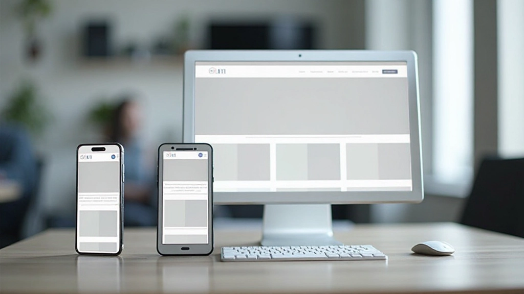
Mobile-First Design Approach — Why It Matters
Start with mobile, then enhance for larger screens. We’ll explain why this method produces better results and how to implement it correctly.
Read MoreLearn how to build websites that look great on every device. We’re focused on teaching the fundamentals of responsive design, mobile-first development, and adaptive layouts that work in the real world.
Whether you’re starting out with web design or looking to sharpen your skills, you’ll find practical guidance here. Our training materials cover everything from CSS media queries to flexible grids — the core techniques that make websites responsive across phones, tablets, and desktops.
Explore our collection of in-depth guides and tutorials on responsive web design techniques

Start with mobile, then enhance for larger screens. We’ll explain why this method produces better results and how to implement it correctly.
Read More
Media queries are the backbone of responsive design. Learn how to write them effectively and choose breakpoints that match real device sizes.
Read More
Modern layout techniques that adapt automatically to different screen sizes. We’ll cover flexbox and grid with practical examples you can use today.
Read More
Your responsive design needs to work across real devices. Discover tools, techniques, and best practices for thorough testing and optimization.
Read MoreUse percentages and flexible units instead of fixed pixels. This allows your content to scale smoothly across all screen sizes without breaking the design.
Images should scale with their containers. Set max-width: 100% to prevent images from exceeding their container width on smaller screens.
Apply different styles at specific breakpoints. This lets you optimize the layout, typography, and spacing for each device category.
Make buttons and interactive elements large enough to tap comfortably on mobile devices. Aim for at least 48×48 pixels for touch targets.
Responsive sites should load quickly on mobile connections. Optimize images, minimize CSS and JavaScript, and prioritize critical content.
On mobile, show the most important content first. Use CSS to reorder elements, hide less critical information, or display it differently at smaller breakpoints.
You don’t need advanced tools or years of experience. Here’s a practical path forward.
Start with this one line: <meta name=”viewport” content=”width=device-width, initial-scale=1″>. It tells mobile browsers how to render your page properly.
Create a simple breakpoint at 768px. Change the layout from single-column on mobile to two-column on tablets and above. You’ll see the power immediately.
Don’t just resize your browser. Test on actual phones and tablets if you can. Browser DevTools are helpful, but nothing beats real-world testing.
Start with mobile styles, then add complexity with media queries as screen size increases. This approach keeps your CSS organized and your site fast.