Understanding CSS Media Queries and Breakpoints
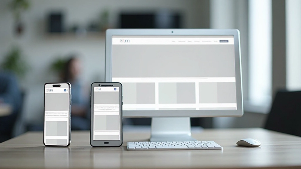
Media queries are the backbone of responsive design. Learn how to write them effectively and choose breakpoints that match real device sizes.
What Are Media Queries?
Media queries are CSS rules that apply different styles based on device characteristics — mainly screen size, but also orientation, resolution, and device type. They’re the fundamental tool that lets you create one HTML structure that looks great on phones, tablets, and desktops.
Instead of building separate websites for different devices, you write CSS that adapts. A media query checks if certain conditions are met (like “is the screen wider than 768 pixels?”), and if they are, those styles apply. It’s elegant, efficient, and it’s how modern responsive design actually works.
Here’s the thing — you don’t need to memorize device sizes. You don’t need “one breakpoint fits all.” You need to understand how media queries work and where your specific design actually needs to change. That’s what we’re covering here.

The Basic Syntax You Need
Media query syntax is straightforward. You start with @media, specify your condition, then add your CSS rules inside curly braces. The most common condition checks the viewport width using min-width or max-width.
@media (min-width: 768px) {
  .container {
    max-width: 750px;
  }

  .sidebar {
    display: block;
    width: 250px;
  }
}
That code says: “If the screen is 768 pixels wide or larger, apply these styles.” You can combine conditions too. Want styles that only apply on tablets in landscape? You can do that. Need different styles for screens between 600 and 900 pixels? Also possible.
The key is understanding min-width versus max-width. Min-width applies when you’re AT that width or wider. Max-width applies when you’re AT that width or narrower. Most developers use min-width with mobile-first design because you start small and enhance as screens get bigger.

Choosing Your Breakpoints
Here’s where most people get confused. They think “mobile is 320px, tablet is 768px, desktop is 1024px” — and that’s the end of it. Actually, it’s more nuanced. Your breakpoints should match where YOUR design actually breaks, not arbitrary industry standards.
That said, there are common starting points that work well for most projects. Mobile devices typically range from 320px to 480px. Tablets sit around 768px to 1024px. Desktops start at 1024px and go up from there. But here’s the real skill — test your design, find where it looks awkward, and add a breakpoint there.
A practical approach: Start with three breakpoints. Small screens (640px), medium screens (1024px), and large screens (1440px). This covers phones, tablets, and desktops without being excessive. Then, as you build and test, you’ll see if you need anything in between. Maybe your design needs adjustment at 900px. Fine — add it. You’re in control.

Best Practices That Actually Matter
Mobile First, Always
Write your base styles for mobile devices, then use min-width media queries to enhance for larger screens. This approach is simpler to maintain and performs better because you’re not hiding elements on small screens.
Test Real Devices
Browser DevTools are helpful, but they don’t tell the whole story. Real phones have different pixel densities, touch behavior, and network speeds. Test on actual devices whenever you can. You’ll catch things the browser simulator misses.
Use Relative Units
Avoid fixed pixel widths. Use percentages, em, or rem units so your design scales proportionally. Flexbox and CSS Grid also handle sizing better than rigid pixel-based layouts. This makes your breakpoints less brittle.
Keep Media Queries Organized
Group your media queries logically. Some developers put all media queries at the bottom of the CSS file. Others nest them near each component. Pick a system and stick with it. Future you will be grateful.
Don’t Forget Landscape
Phones and tablets can be held vertically or horizontally. Use the orientation media query when it matters. A tall narrow layout might work great in portrait but look awful in landscape — adjust for it.
Progressive Enhancement
Assume basic functionality works on all devices, then enhance it for better browsers. This means your site stays usable even if media queries aren’t supported (rare, but it happens). It’s also better for accessibility.
Putting It All Together
Media queries aren’t complicated once you understand the basic pattern. You’re essentially asking CSS questions: “Is the screen this wide? Then apply these styles.” Simple, powerful, and essential for modern web design.
The real skill isn’t memorizing breakpoints. It’s understanding where your design needs to adapt, writing clean media queries that maintain your styles, and testing across real devices. Start with mobile-first, use logical breakpoints, and don’t be afraid to add more if your design needs it.
Your next project will be responsive from day one because you’ll build it mobile-first with media queries from the start. And when you encounter a design that doesn’t quite work at a certain screen size, you’ll know exactly how to fix it. That’s responsive design in practice.

Important Note
This guide provides educational information about CSS media queries and responsive design principles. The techniques and practices described here represent current best practices in web development. However, specific implementation may vary based on your project requirements, browser support needs, and performance considerations. Always test your responsive designs across real devices and browsers. Web standards and browser capabilities continue to evolve, so staying updated with current documentation is recommended.