Flexible Layouts With Flexbox and CSS Grid
Modern layout techniques that adapt automatically to different screen sizes. We’ll cover flexbox and grid with practical examples you can use today.

Why Layout Matters in Responsive Design
Building websites that work everywhere starts with choosing the right layout approach. Flexbox and CSS Grid aren’t just technical tools — they’re the foundation of how your content flows and adapts across devices. The good news? You don’t need to pick one or the other. Most real projects use both, and once you understand when each shines, you’ll design layouts that feel natural instead of forced.
We’re going to walk through how these two methods work, where they overlap, and practical patterns you can apply immediately. By the end, you’ll understand why developers reach for flexbox in some situations and grid in others — and how to combine them for layouts that just work.
Understanding Flexbox: One Dimension at a Time
Flexbox excels at arranging items in a single dimension — either a row or a column. Think of it like a line of items that automatically distribute space between them. That’s its strength. It’s perfect for navigation bars, button groups, card layouts, and any situation where you’re arranging items along one axis.
Here’s what makes flexbox special: it’s predictable. When you set display: flex, items become flexible containers. You control alignment, direction, wrapping, and space distribution with just a few properties. The flex property itself is powerful — it handles growing and shrinking automatically based on available space.
CSS Grid: Two Dimensions Made Simple
Grid works differently. Instead of a single line, you’re creating a two-dimensional layout — rows and columns at the same time. This is powerful when you need control over both directions simultaneously. Imagine designing a magazine layout where certain items span multiple columns or a dashboard where components need precise positioning.
What’s remarkable about Grid is how readable your code becomes. You define columns and rows upfront, then place items exactly where they belong. The syntax is explicit. When you look at grid-template-columns: repeat(3, 1fr), you immediately know you’re getting three equal columns.
Choosing Between Them: Real-World Patterns
Here’s the practical truth: you’ll use both in nearly every project. The decision isn’t about which is better — it’s about what the layout needs.
Use flexbox when you’re organizing items in a single direction and want them to respond to content size. Navigation menus, button groups, and card layouts inside a container work beautifully with flexbox. It’s forgiving. If content grows, flexbox wraps naturally.
Reach for Grid when you need precise two-dimensional control. Page-level layouts, dashboard dashboards, and magazine-style designs are Grid’s sweet spot. You define the structure upfront and place items intentionally. It’s more formal but incredibly powerful.
Pro tip: Combine them. Use Grid for your page structure and Flexbox inside grid cells for component layouts. This hybrid approach gives you the best of both worlds.
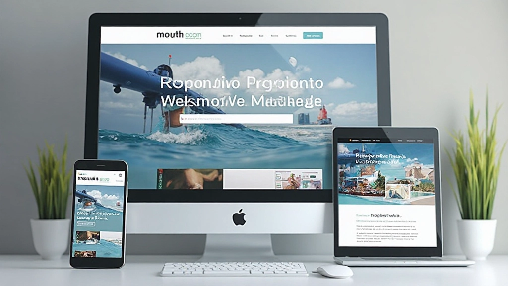
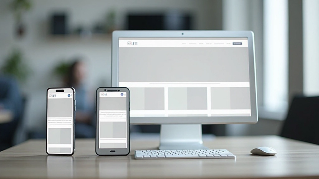
Making Layouts Responsive: From Mobile to Desktop
Responsive layouts aren’t about guessing breakpoints. They’re about understanding how your layout needs to change at different screen sizes. Mobile users see a single column. Tablet users get two columns. Desktop users might see three or four. Both flexbox and Grid handle this elegantly with media queries.
With flexbox, you might change flex-direction from column on mobile to row on desktop. With Grid, you adjust grid-template-columns from 1fr on mobile to repeat(3, 1fr) on desktop. The content stays the same. The layout adapts. That’s responsive design working as intended.
The key is thinking mobile-first. Start with your mobile layout, then enhance it for larger screens. This approach keeps your code clean and your users happy because performance stays strong even on slower connections.
Building Layouts That Adapt
Flexbox and CSS Grid aren’t competing tools — they’re complementary. You’ll develop a feel for which to reach for as you build more projects. Start simple. Use flexbox for components and one-dimensional layouts. Use Grid for page structure. Combine them. Test on real devices, not just browsers. Pay attention to how your layouts respond to different content lengths and screen sizes.
The layouts that feel natural aren’t accidents. They’re the result of understanding your tools and making intentional choices about how content flows and adapts. Once you internalize flexbox and Grid, you’ll find yourself designing more flexible interfaces that work beautifully everywhere.
Ready to deepen your understanding?
Explore our complete responsive design training program and master modern layout techniques.
Explore More ResourcesEducational Note
This article provides educational information about CSS layout techniques. Browser support varies across different versions and devices. Always test your layouts on real devices and browsers before deploying to production. CSS specifications and browser implementations evolve — check current documentation for the latest features and compatibility details. This content is intended to help you understand fundamental concepts; specific implementation details may vary based on your project requirements.