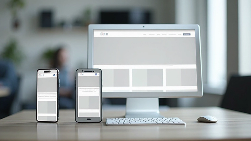
Mobile-First Design Approach — Why It Matters
Start with mobile, then enhance for larger screens. We’ll explain why this method produces better results and how to implement it correctly.

What Is Mobile-First Design?
Mobile-first design means you start building for small screens, then progressively enhance your website for tablets and desktops. It’s the opposite of how many designers worked a decade ago — they’d build for desktop first, then try to squeeze everything into a mobile view.
The approach makes sense when you think about the numbers. Over 60% of web traffic comes from mobile devices. Your users are probably opening your site on their phones first. So why design for desktop? Mobile-first thinking ensures the most critical content and functionality work perfectly on the smallest screens, where it matters most.

Why Mobile-First Actually Works
Here’s the thing — when you start with mobile, you’re forced to prioritize. There’s no room for fluff. You can’t add seven navigation items or auto-playing videos that eat bandwidth. You decide what really matters and build around that.
Performance improves dramatically. Mobile devices have slower connections and less processing power than desktops. When you design for these constraints first, your site naturally loads faster for everyone. That matters because slow sites lose users. Studies show people abandon websites after 3 seconds of waiting.
You’ll also get better accessibility without extra effort. Designing for small screens forces you to use bigger touch targets, clearer text, and logical hierarchies. These same features help people with disabilities navigate your site more easily.

How to Implement Mobile-First Design
The process is straightforward but requires discipline. Let’s break it down into clear steps.
Design for 320px Width First
Start your design mockups at 320 pixels wide — that’s roughly the smallest smartphone screen. Design everything to fit here. You’ll make decisions about layout, font sizes, button sizes, and spacing based on these constraints.
Write Mobile-First CSS
Your CSS should target mobile devices by default. Then you use media queries to add enhancements for larger screens. This means writing min-width media queries, not max-width ones. Your base styles are simple; complexity increases as viewport grows.
Test on Real Devices
Browser emulation is helpful, but nothing beats testing on actual phones and tablets. You’ll discover issues with touch targets, readability in sunlight, and performance on slower connections that emulators don’t reveal.
Progressive Enhancement
Add features and enhancements as you move to larger screens. A two-column layout might become three columns at desktop. Extra navigation options appear. Images get higher resolution. It’s building up, not removing things.

Common Pitfalls to Avoid
Many teams start with mobile-first intentions but fall back into old habits. They’ll design desktop first anyway because “that’s what we always do.” Or they’ll neglect mobile during development, treating it as an afterthought.
Don’t make your mobile layout too cramped just to be different from desktop. It should be clean and functional, not minimal to the point of being hard to use. Your mobile experience should be genuinely good, not just “okay for a phone.”
Another mistake? Forgetting about touch. Desktop designs often use small hover states and tiny click targets. Mobile users have fingers, not cursors. Your buttons need to be at least 44 pixels tall. Links need breathing room.
Real-World Benefits
When you commit to mobile-first design, the results compound across your entire project.
Faster Load Times
Building for mobile constraints from the start means optimized images, lean CSS, and minimal JavaScript. Your entire site loads quicker on every device.
Better Mobile Experience
You’re not forcing a desktop layout into a mobile container. Your mobile site is purpose-built, not a scaled-down version of something else.
SEO Advantages
Google prioritizes mobile-friendly sites in search results. Your mobile-first approach signals to search engines that you’re serious about the mobile experience.
Improved Accessibility
Constraints breed clarity. Bigger text, larger buttons, and logical structure benefit everyone, especially people using assistive technologies.
Start Small, Think Big
Mobile-first design isn’t a trend that’s fading. It’s become the standard because it works. Your users are on mobile devices, and they deserve a site that’s been designed specifically for them, not just adapted from desktop.
The good news? You don’t need special tools or expensive software to get started. A mobile-first mindset costs nothing. It just requires discipline to start with constraints instead of features, to prioritize ruthlessly, and to test on actual devices.
If you’re building a new site or redesigning an existing one, we recommend starting your next project with mobile-first thinking. Design for 320px first. Build your CSS mobile-first. Test on real phones. You’ll create a better website for everyone.
Disclaimer
This article provides educational information about mobile-first design principles and web development practices. The approaches and techniques discussed represent current industry standards and best practices. Implementation details may vary based on your specific project requirements, team expertise, and business goals. We recommend consulting with experienced web developers and designers to adapt these concepts to your particular situation. Technology and best practices evolve continuously, so we encourage staying updated with current industry resources and documentation.


